
A Prop Store Article?
Listers Blue Midget Jumpsuit | 'Back In The Red' Part Three | £895
Yep. Listers, apparently. GET YOUR APOSTROPHES RIGHT YOU STUPID FUCKS.
Model Miniature Section Of The SSS Esperanto | Back To Reality | £295
"We've been here before." "Of course we have, it's the cockpit, dummy. We come here all the time."
Ships Issue Carrot Tin | Series III | £75
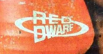
Lovely. And the perfect place for me to mention something that I've been meaning to for ages: the very odd version of the Dwarf logo on the tin, also seen in various other places (most notably on the chilli powder at the start of Polymorph). Presumably, it's an early version of the logo. The same goes for the version on some of Lister's clothes in III (in Marooned, for example); much closer to the version we know and love, but without the red D's. Very interesting.
(Actually, there's a whole article to be written about this; the logo has gone through many variations throughout its life; it isn't just as simple as "sans-serif" and "serif". And why, for example, was the sans-serif version used in the continuity for Red Dwarf Night in 1998, when it was last used in 1991 and the serif version was launched in 92? INTERESTINGNESS ABOUNDS.)
Kryten Watch Display | IV, at least. Can't be arsed checking the rest. | £495
Two things. One: I never noticed Kryten wore a watch. Two: why the FUCKITY FUCKING FUCK would a mechanoid need one?
Lister Injecting Gun | Epideme | £395
Not much to say about this one; so instead, I'll mention that this is the last RD prop listed not to have a horrible Prop Store watermark plastered across the middle of the larger pictures on the site. All the above have the aforementioned monstrosity, and it annoys me rather more than it should do. Possibly because you'd think that they charge so much for the props that the least they could do is provide a few nice piccies...
Comments
The "white Ds" can also be seen on the logos for the Red Dwarf Omnibus (1992) and Primordial Soup (1993). The former can be explained in that the logo is used as the first letter of "Omnibus", but there's no such explanation for the latter.
There's also two different types of serif logo - the video releases for series 4 (which still used sans-serif within the episodes) used a serif font for the Video sleeves familiar to the later series' - but with a rather odd 3D effect added.
Anyway, as you can probably guess ; I would be rather interested in such an article.
Posted by Pete Martin at April 26, 2004 10:50 PM
There's also the fact that sometimes the ellipsis shows through the Ds, and sometimes it doesn't. And the fact that the serif font used isn't always the same...
Actually, I'll make this the next article I do.
Posted by John Hoare at April 26, 2004 10:59 PM
See you in about twenty years, then.
Posted by Ian Symes at April 26, 2004 11:01 PM
You bastard.
Posted by John Hoare at April 26, 2004 11:04 PM
Cryton does teh wears a watche so is he cans telll teh time cos teh clock in his brian is broked.
Posted by Darrell Jones at April 26, 2004 11:13 PM
> I would be rather interested in such an article.
Strangely enough, so would I.
Why is it that there is a certain kind of person interested in that sort of thing? It's immensely heartening when you find that other people are. Like in last month's issue of When Saturday Comes, when there was an article on the history of shirt numbers in football. 99% of football fans would consider that boring as shit. And then there's me, and the author of the article. Ace.
Posted by Seb Patrick at April 27, 2004 12:24 AM
I'm looking forward to this article too. I attempted something similar a few years ago for my first RD site (GELF Space if anyone remembers it), but at the time didn't know of much technical language (Serif etc) so it wasn't that great.
Does anyone remember the PCB logo from RD Night? I used to love that one...
Posted by Blake at April 27, 2004 01:27 AM
"(Actually, there's a whole article to be written about this; the logo has gone through many variations throughout its life; it isn't just as simple as "sans-serif" and "serif". And why, for example, was the sans-serif version used in the continuity for Red Dwarf Night in 1998, when it was last used in 1991 and the serif version was launched in 92? INTERESTINGNESS ABOUNDS.)"
Could you include in this article the following metamorphoses?:
1) Rimmer's H
2) Kryten's head
Posted by Vanity Fairline at April 27, 2004 09:50 AM
3) The Cat's gradual decline to SHITE!
Actually, that's an article in itself.
Posted by Cappsy at April 27, 2004 10:49 AM
Rimmer's H interests me, yes. He and all the other holograms could be an off-shoot of that article. Unfortunately, I'm shite at spotting differences in Kryten's head - it all looks like freak formations of mashed potato to me.
Posted by Ian Symes at April 27, 2004 11:22 AM
Series 3 and 4 were similar to one another Series 5 and 6 were similar to one another. Series 7 was weird with the angular points for some reason a lighter tone. Series 8 was I don't know, a refined version of the series 6 one I suppose. There were changes in the costume too. And in everybody else's costumes. I think you could analyse them closely and find connections between them and the Red Dwarf logo font. If you could be bothered.
Posted by Vanity Fairline at April 27, 2004 12:44 PM
And Kryters sometimes has those LEDs on his shoulder pads. The LEDS that don't actually Emit Light.
Posted by Pete Martin at April 27, 2004 01:39 PM
Every Kryten head is visibly different. I could probably spot them from photos, the changes aren't really that subtle. The closest are probably 5 and 6.
Posted by Darrell Jones at April 27, 2004 01:48 PM
Well four and five can be compared as well. And there's an evolution between three and four too. I'd say the heads clearly evolve from 3 to 6, then take a tangent at 7 before coming back at 8, that's my one.
Posted by Cunt Merchant at April 27, 2004 02:13 PM
While we're at it, why the hell does Kryters have a silver costume in Series VII?
(actually, perhaps that falls under the "Series VII Sucks" article. Take yer pick.)
Posted by Seb at April 27, 2004 02:21 PM
I like the VII head, its the VIII head I don't like its really squashy and small and too rubbery looking. I prefered the sturdier plasticy looking heads. Although it might just be the badness of VIII thats subliminally linking it.
Posted by OOoo at April 27, 2004 03:27 PM
Why the fuck did they have to start making the mask more comfortable for Robert Llewellyn anyway? From series VII onwards they changed the glue for a start, and they may have changed the rubber into a more breathable varient. But it was good when Robert was uncomfortable! For series VII and VIII he's less inhibited, and for those series he's prancing like a pixie for the best part of each episode.
Posted by jesley carrion at April 27, 2004 03:55 PM
You sadist!
Posted by Cappsy at April 27, 2004 04:02 PM
While we're at it, why the hell does Kryters have a daft "naked" costume in Series VIII?
(actually, perhaps that falls under the "Series VIII Sucks" article. Take yer pick.)
Posted by Seb at April 27, 2004 05:24 PM
Oh, and another thing. This might just be my favourite Prop Store item ever :
"An empty ship issue cigarette packet used in the BBC television series Red Dwarf. The cardboard packet has been sprayed silver to give it a futuristic look. This style of packet can be seen in the Series 1 episode called �Balance of power� when Rimmer catches Cat wheeling a trolley full of them through the corridors. Measures 9cm x 5cm (3.5" x 2")."
Maybe it's just me, but perhaps - just perhaps - this could just be a normal, empty cigarette packet painted silver, with absolutely no actual connection to the Dwarf whatsoever?
Posted by Seb at April 27, 2004 05:27 PM
There were some silver-painted coke cans on eBay a while ago, which claimed to be RD props. I think GNP got involved to shut it down, but I'm not sure.
Worst Kryten mask = RD USA. It's also the most comfortable. Conclusion - MAKE ROBERT SUFFER.
Posted by Ian Symes at April 27, 2004 08:18 PM
They should make it out of frozen bleach with pins in.
Then set his legs on fire.
That'd bring out his best performance in theory. In reality he'd probably be running around, screaming, yelping and burning.
Posted by Darrell Jones at April 28, 2004 12:14 AM
"Worst Kryten mask = RD USA. It's also the most comfortable. Conclusion - MAKE ROBERT SUFFER."
Yes!!!! Ian - I'm beginning to like you.
Posted by jesley carrion at April 28, 2004 01:00 AM
"That'd bring out his best performance in theory. In reality he'd probably be running around, screaming, yelping and burning."
Well if you can't see it beneath the costume I think that's fine. The main thing is he shouldn't be demonstrating the comfort of his costume by tip-toeing around laying traps everywhere and things like that. I suspect his generally OTT performance in series VII (that curry scene, the crying stuff, etc) could be largely blamed on him feeling invigorated and less cramped.
Posted by Standoff at April 28, 2004 09:15 AM
"...could be largely blamed on him feeling invigorated and less cramped."
Or maybe you could blame Ed Bye's directing. Or Doug for writing scenes in which "Kryten gets ridiculously upset".
Posted by Pete Martin at April 28, 2004 09:27 AM
Kryten's Watch appears in "Demons and Angels" He looks at it when he says "Less than 2 minuites" Though I still think he should have some sort of time telling programe in his CPU or something...
Posted by MJN SEIFER at April 28, 2004 03:51 PM
For sale: The part responsible for time-telling in Kryten's CPU, genuinely used by the character in Demons and Angels but not seen because it's inside him - weren't you listening? Anyway, buy it.
Posted by z at April 28, 2004 04:27 PM
Post a comment
<trackback>
TrackBack URL for this entry: http://admin.ofla.info/movabletype/mt-tb.cgi/359
Listed below are links to weblogs that reference 'A Prop Store Article?' from Ganymede and Titan.